Preparation
January – May 2019
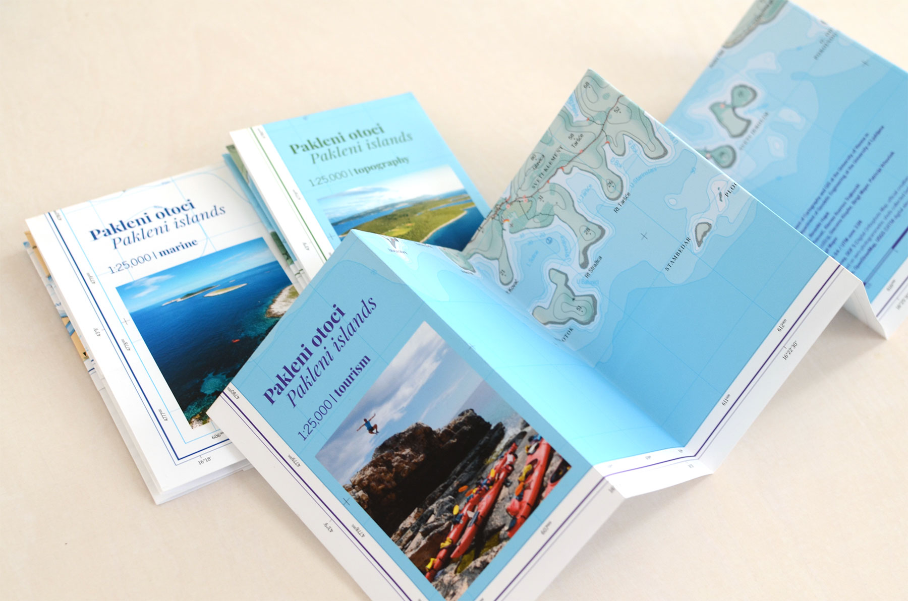
The Field Trip to the Pakleni islands was part of a Proseminar at the University of Vienna and the University of Ljubljana with the goal of creating three maps of the area of interest based on open data: a topographic map, a tourism map and a nautical chart. To achieve this we split into three groups – each consisting of two students from Austria and one from Slovenia. Our maps needed to be ready before we left for the field trip in order to probe and refine them during our stay on the islands, so we defined milestones and started to work. Before the trip we had six meetings, starting on January 17th and then in irregular intervals through May 2019, where we presented our interim results and defined new goals. Very important for a transparent work flow was the documentation. Therefore we kept a protocol in every session. The combined protocols can be downloaded here.
In a first step of the map-making-process we had to do a data acquisition. The following data sources were used:
- openstreetmap.org
- usgs.gov (SRTM digital elevation model)
- navionics.com
- geoportal.dgu.hr (DOF 5 – Digital Orthophoto Map, official croatian state map at a scale of 1.5000 based on aero-photogrammetric shots collected between 2014 and 2016)
Before editing our data we decided on a clipping frame and an appropriate coordinate system (WGS 84 / UTM zone 33N) to be able to share our edited data within the three groups.
The flow chart below shows the steps we took from Data Acquisition to the design process. We worked with QGIS, Adobe Photoshop, Adobe Illustrator and Inkscape.
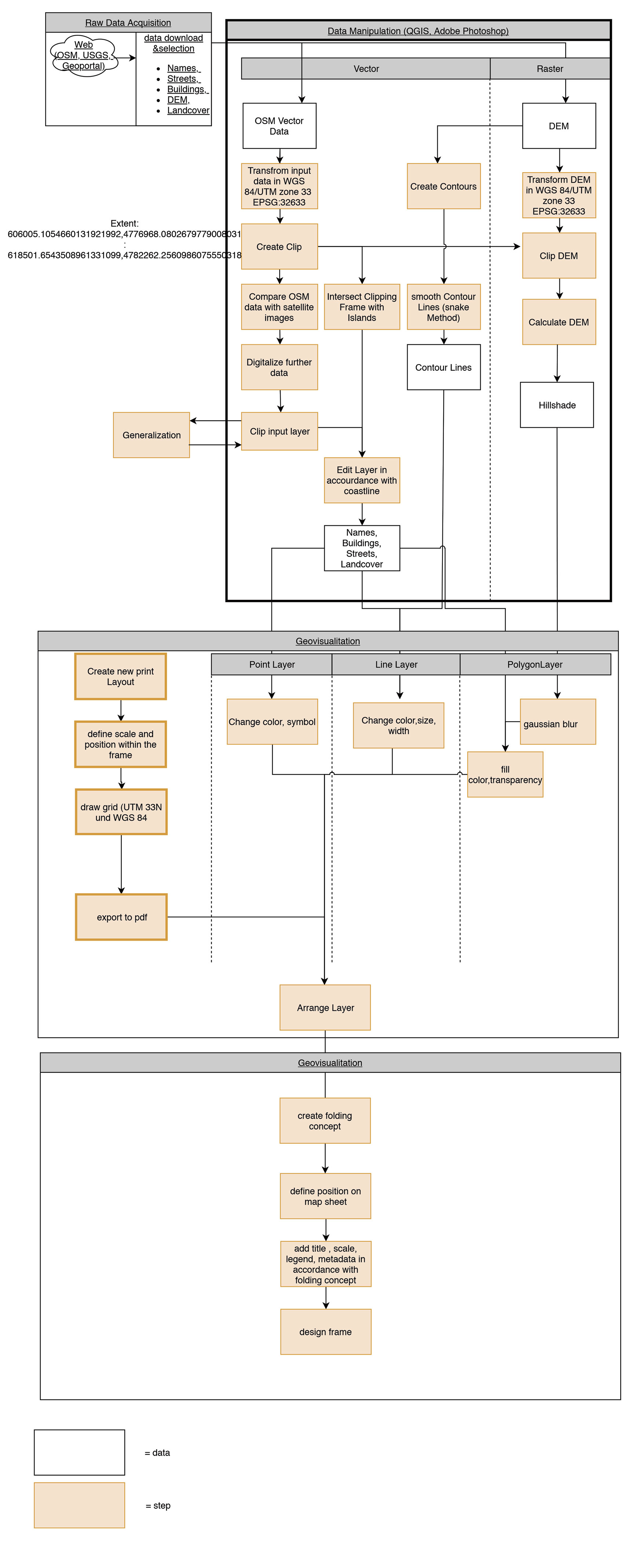
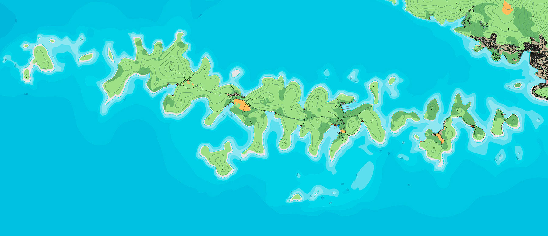
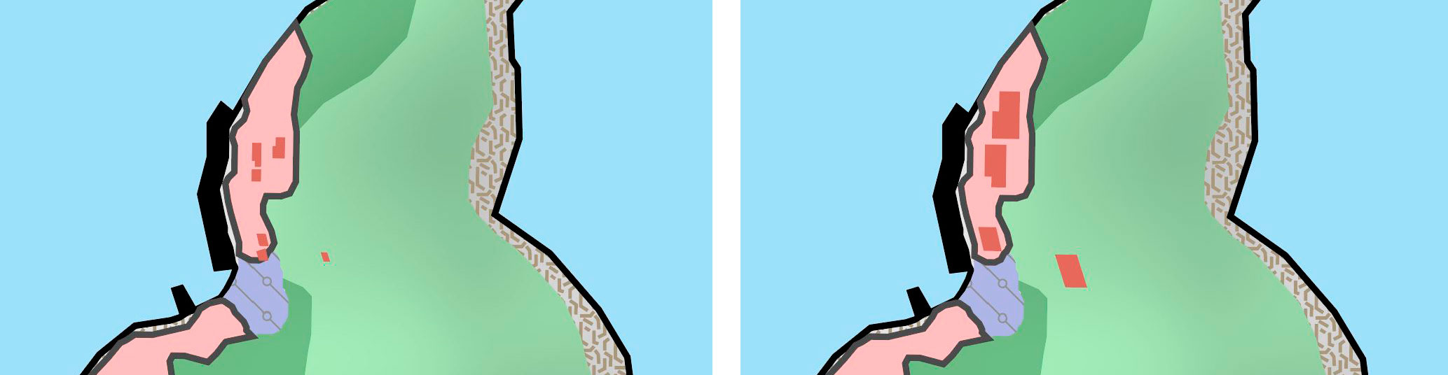
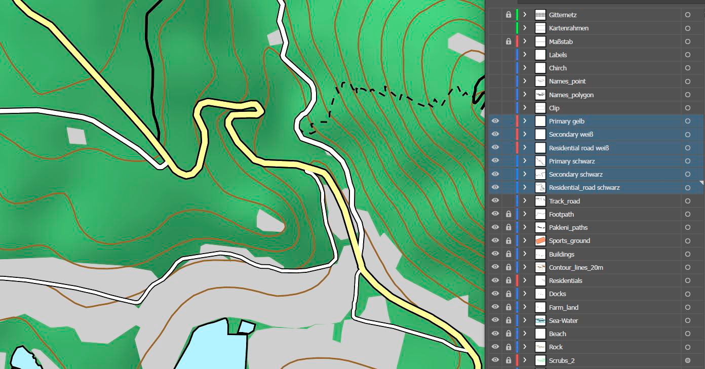
There was not a lot of open data available, so we digitised layers like landuse, but also most of the paths, from high resolution orthophotos or – as in case for the altitude points, from existing maps. For most of our vector data we had to do generalisation. Buildings for example are shown bigger in our maps for better visibility at a scale of 1:25,000. Streets and contours were smoothed to get a better visualisation.
After we had edited all the needed layers, we used QGIS Print composer to export the data for further styling in Adobe Illustrator. It was important to define the position of the map in the map layout in this step, so we could simply copy/paste new layers to the Illustrator file at a later point.
After all the layers were sorted in Illustrator, we created symbols and graphic styles, that were then applied to the layers.
The different streettypes for example are all seperated to a new layer, in order to apply a unique style to each of them.
We decided to use the same map layout for all of our three maps, because we wanted to produce a series. The layout was also done in Adobe illustrator. According to our claim to produce maps for simple use we also needed a folding concept. This made the layouting more complicated of course, because the maps need to look good folded and unfolded, but we believe the end product was worth the effort.